Token Overview
The complete reference for the Marigold design token system
Design tokens are the bridge between design decisions and code. They capture color, spacing, elevation, and motion as named variables so that every component speaks the same visual language. Names describe purpose, not appearance, so a token stays correct even when its value changes.
How token names work
Tokens are used as Tailwind CSS utility classes. A class name has up to three parts:
border-destructive-accent
|       |          |
|       role       emphasis
property- Property: the Tailwind prefix that determines the CSS property:
bg-,text-,border-,shadow- - Role: the semantic purpose:
primary,disabled,surface,hover - Emphasis: an optional intensity modifier:
-foreground,-accent,-surface
For example, border-destructive-accent breaks down into the property border-, the role destructive, and the emphasis -accent, giving you the vivid red border used on error messages.
Background and foreground pairing
Many tokens come in pairs: a background token and a -foreground token for text on that background. Always use the paired foreground when placing text on a colored background.
| Background | Foreground | Example |
|---|---|---|
bg-primary | text-primary-foreground | Buttons |
bg-selected-bold | text-selected-bold-foreground | Binary controls (Checkbox, Switch) |
bg-destructive | text-destructive-foreground | Error badges, section messages |
bg-destructive-bold | text-destructive-bold-foreground | Destructive button |
bg-access-master | text-access-master-foreground | Master access rows |
bg-access-admin | text-access-admin-foreground | Admin access rows |
Tokens without a foreground pair:
muted: usestext-foreground(the tint is light enough for regular text)hover: usestext-foregroundselected: no explicit text color set on selectionfocus-highlight: no explicit text color set on focusfocus-highlight-bold: usestext-foreground(the stronger tint still meets contrast with regular text)surface: usestext-foregroundortext-secondarysoft: usestext-foreground(the near-white cap is light enough for regular text)secondary,placeholder: these ARE text tokens, not backgroundsdisabled: primarily a text token. When a background is needed, pair withbg-disabled-surface(see Disabled for details)
These tokens do not need a dedicated foreground color because they already meet WCAG/APCA contrast requirements with text-foreground or their respective text tokens.
Do
Always use the paired -foreground token when placing text on a colored
background: bg-primary + text-primary-foreground.
Don't
Don't use text-foreground on colored backgrounds. It may not have
sufficient contrast.
foreground vs primary
foreground and primary share the same charcoal value but serve different
roles. foreground is the default body text color. primary is the
action/interaction color (buttons, selections). A theme could change primary
to blue while foreground stays dark.
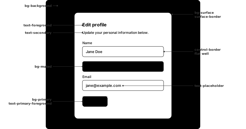
Tokens in context
This diagram shows how tokens map to a typical form card. The gray page background (bg-background) contrasts with the white card surface (bg-surface), creating natural visual hierarchy.
Color palette
The RUI theme is built on a warm neutral palette called charcoal, an oklch gray with a subtle warm hue (hue 54). The 11-step scale runs from near-white (50) to near-black (950). All semantic color tokens below reference values from this palette.
Contrast matrix
This matrix shows the contrast ratio between every pair of charcoal steps. Use it to verify that your text and background combinations meet accessibility requirements.
| Bg \ Text | 50 | 100 | 200 | 300 | 400 | 500 | 600 | 700 | 800 | 900 | 950 |
|---|---|---|---|---|---|---|---|---|---|---|---|
| 50 | AaLc 01.0:1 | AaLc 01.1:1 | AaLc 131.2:1 | AaLc 241.5:1 | AaLc 452.2:1 | AaLc 643.5:1 | AaLc 775.3:1 | AaLc 898.1:1 | AaLc 9912.2:1 | AaLc 10616.6:1 | AaLc 11018.9:1 |
| 100 | AaLc 01.1:1 | AaLc 01.0:1 | AaLc 01.1:1 | AaLc 201.4:1 | AaLc 412.1:1 | AaLc 603.3:1 | AaLc 735.0:1 | AaLc 857.7:1 | AaLc 9511.5:1 | AaLc 10215.6:1 | AaLc 10517.8:1 |
| 200 | AaLc 131.2:1 | AaLc 01.1:1 | AaLc 01.0:1 | AaLc 121.2:1 | AaLc 331.8:1 | AaLc 512.9:1 | AaLc 654.3:1 | AaLc 766.7:1 | AaLc 8610.0:1 | AaLc 9313.7:1 | AaLc 9715.6:1 |
| 300 | AaLc 241.5:1 | AaLc 201.4:1 | AaLc 111.2:1 | AaLc 01.0:1 | AaLc 211.5:1 | AaLc 402.4:1 | AaLc 533.6:1 | AaLc 655.5:1 | AaLc 758.3:1 | AaLc 8211.3:1 | AaLc 8612.9:1 |
| 400 | AaLc 452.2:1 | AaLc 402.1:1 | AaLc 321.8:1 | AaLc 201.5:1 | AaLc 01.0:1 | AaLc 191.6:1 | AaLc 332.4:1 | AaLc 443.7:1 | AaLc 545.5:1 | AaLc 617.5:1 | AaLc 658.5:1 |
| 500 | AaLc 633.5:1 | AaLc 593.3:1 | AaLc 502.9:1 | AaLc 392.4:1 | AaLc 181.6:1 | AaLc 01.0:1 | AaLc 141.5:1 | AaLc 262.3:1 | AaLc 353.5:1 | AaLc 434.7:1 | AaLc 465.4:1 |
| 600 | AaLc 765.3:1 | AaLc 725.0:1 | AaLc 644.3:1 | AaLc 523.6:1 | AaLc 312.4:1 | AaLc 131.5:1 | AaLc 01.0:1 | AaLc 121.5:1 | AaLc 222.3:1 | AaLc 293.1:1 | AaLc 333.6:1 |
| 700 | AaLc 888.1:1 | AaLc 847.7:1 | AaLc 756.7:1 | AaLc 645.5:1 | AaLc 433.7:1 | AaLc 242.3:1 | AaLc 111.5:1 | AaLc 01.0:1 | AaLc 101.5:1 | AaLc 182.0:1 | AaLc 212.3:1 |
| 800 | AaLc 9812.2:1 | AaLc 9411.5:1 | AaLc 8510.0:1 | AaLc 748.3:1 | AaLc 535.5:1 | AaLc 343.5:1 | AaLc 212.3:1 | AaLc 01.5:1 | AaLc 01.0:1 | AaLc 01.4:1 | AaLc 111.6:1 |
| 900 | AaLc 10616.6:1 | AaLc 10115.6:1 | AaLc 9313.7:1 | AaLc 8111.3:1 | AaLc 607.5:1 | AaLc 424.7:1 | AaLc 283.1:1 | AaLc 172.0:1 | AaLc 01.4:1 | AaLc 01.0:1 | AaLc 01.1:1 |
| 950 | AaLc 10918.9:1 | AaLc 10517.8:1 | AaLc 9615.6:1 | AaLc 8512.9:1 | AaLc 648.5:1 | AaLc 465.4:1 | AaLc 323.6:1 | AaLc 202.3:1 | AaLc 111.6:1 | AaLc 01.1:1 | AaLc 01.0:1 |
Color tokens
Page background & text
The foundational layer: page background and text hierarchy.
| Token | Value | Use for | |
|---|---|---|---|
backgroundvar(--color-background) | charcoal-100 | Page-level background (<body>), gray so white surfaces separate from it by fill | |
foregroundvar(--color-foreground) | charcoal-900 | Primary body text | |
secondaryvar(--color-secondary) | charcoal-600 | Help text, descriptions, input icons | |
secondary-boldvar(--color-secondary-bold) | charcoal-700 | Emphatic secondary text that must out-rank quiet captions without reaching full foreground — e.g. idle sidebar nav labels above group labels | |
placeholdervar(--color-placeholder) | charcoal-600 | Placeholder text in empty inputs |
<body className="bg-background text-foreground">
  <p>Primary text</p>
  <p className="text-secondary">Secondary text</p>
</body>
No pairing needed
secondary, secondary-bold and placeholder are standalone text colors.
They do not have a paired background token. secondary is the industry
standard name for this role (Carbon, Material Design, Atlassian all use
"secondary" for secondary text); secondary-bold follows the system's -bold
emphasis modifier (cf. selected/selected-bold) for text that sits between
secondary and foreground.
Primary
The primary token represents the strongest visual weight in the interface. It is reserved for elements that trigger an action: buttons, links styled as buttons, and similar call-to-action surfaces. Primary draws the eye and signals "this is the main thing you can do here."
| Token | Value | Use for | |
|---|---|---|---|
primaryvar(--color-primary) | charcoal-900 | Button backgrounds, call-to-action elements | |
primary-foregroundvar(--color-primary-foreground) | charcoal-50 | Text and icons on primary backgrounds |
<div className="bg-primary text-primary-foreground">Save</div>Do
Use bg-primary for action elements like buttons. Use bg-selected-bold
for binary controls (Checkbox, Radio, Switch, ToggleButton).
Don't
Don't use bg-primary for selection states or large decorative
backgrounds like cards or sections.
Surfaces
The page is gray (bg-background), component panels are lighter (bg-surface). This contrast creates natural visual hierarchy without relying solely on shadows and borders.
Raised surfaces (Card, Panel, Dialog, Menu) draw their rim with surface-border, a translucent decorative hairline applied through the ui-surface utility rather than a standalone border. Controls use the same mechanism with a denser edge, the control-border token covered under Control below. See Borders for the full set of edge tokens, and Elevation for how boundaries combine with the overlay shadow.
| Token | Value | Use for | |
|---|---|---|---|
surfacevar(--color-surface) | white | White component backgrounds (cards, panels, inputs, tables) | |
surface-bordervar(--color-surface-border) | charcoal-950 / 13% | Decorative rim of a raised surface (Card, Panel, Dialog, Menu), applied via ui-surface. Sits below the contrast threshold, so never for an edge that must be seen |
<div className="ui-surface">Content on a white surface</div>Muted
Some elements need a subtle visual distinction from the white surface they sit on without drawing too much attention. Readonly inputs, badges, and table headers all benefit from a light background tint that says "this content is secondary" without implying any interactive state.
| Token | Value | Use for | |
|---|---|---|---|
mutedvar(--color-muted) | charcoal-50 | Subtle tint for readonly inputs, badges, secondary highlights |
// Readonly input with muted background
<input className="bg-muted" readOnly />

// Badge with subtle background
<span className="bg-muted text-foreground">Draft</span>
Do
Use bg-muted for content that is visually secondary but still readable,
like readonly inputs, badges, and table sub-headers.
Don't
Don't use bg-muted for disabled states. Disabled elements need
bg-disabled-surface to clearly signal that interaction is blocked.
Control
Controls carry two neutral tokens. Most define their shape with a border, drawn with control-border through the ui-control utility. A few communicate their state through a filled background instead, and that resting fill is the control token.
control-border is the visible edge of a bordered control such as a text input or a select. It is the denser sibling of surface-border, kept above the contrast threshold so the boundary is always seen. The full set of edge tokens lives under Borders.
Some controls have no border to define them. The switch track is the clearest example. When OFF, the track needs to look like a solid, physical groove that the thumb can slide along. A white or transparent background would make it disappear into the surface, while selected or disabled-surface would send the wrong signal. control fills this gap with a medium-weight neutral background that reads as an interactive control in its resting state, and it pairs naturally with selected-bold for the ON state.
| Token | Value | Use for | |
|---|---|---|---|
control-bordervar(--color-control-border) | charcoal-950 / 26% | Visible boundary of a bordered control (inputs, selects), applied via ui-control. Denser than surface-border and above the contrast threshold, so the edge stays visible | |
controlvar(--color-control) | charcoal-300 | Resting fill for controls that show their inactive state through a background instead of a border (e.g. switch track) |
// Switch track: control when off, selected-bold when on
<div className="bg-control group-selected/switch:bg-selected-bold" />
Not a default for all controls
Most form controls sit on bg-surface (white) and define their shape with a
border. That border is the ui-control ring for inputs and selects, or
border-control-border for checkboxes and radios, and its color is the
control-border token documented with the other edges under
Borders. Only reach for bg-control when a control communicates
its state through a filled background rather than a border, like switch
tracks, slider tracks, and similar "trough" elements.
Do
Use bg-control for controls that communicate state through a filled
background, like the switch track or slider track.
Don't
Don't use bg-control for bordered form controls like text inputs,
selects, or textareas. Those should use bg-surface with the ui-control
ring.
Soft
The secondary Button and the Menu trigger don't wear a boundary at all. They're raised caps: a convex fill gradient with the lift baked into the shading itself, no drop shadow attached. soft is the light, neutral cap. Its dark counterpart, ui-contrast, retints around primary and powers the primary Button and ActionBar instead.
| Token | Value | Use for | |
|---|---|---|---|
softvar(--color-soft) | oklch(0.99 0.002 54) | Resting fill for the soft cap (secondary Button, Menu trigger) | |
soft-hovervar(--color-soft-hover) | charcoal-100 | Fill on hover and expanded states | |
soft-edgevar(--color-soft-edge) | charcoal-200 | Base the soft cap ring derives from (the ring itself sits one step darker, computed at render time) | |
soft-edge-hovervar(--color-soft-edge-hover) | charcoal-300 | Edge base on hover and expanded states |
// Secondary Button / Menu trigger: the soft cap
<button className="ui-soft">Save</button>
Selected
Selection tells users which item has already been chosen. Not every selection looks the same though. Binary controls like checkboxes and switches flip between on and off, so they use bg-selected-bold with text-selected-bold-foreground for a strong, inverted style that clearly communicates the on/off state. List-based components use the quieter bg-selected wash paired with the row's own indicator (the checkbox, radio, or check icon), which carries the selection boundary and its WCAG 1.4.11 contrast. The wash sits one step darker than the hover fill, so a committed row reads heavier than one the cursor merely floats over.
Known issue: secondary text on the selected wash
Because bg-selected is charcoal-300, secondary description text
(text-secondary, charcoal-600) on a selected row lands at 3.6:1, below the
4.5:1 AA minimum. Selection is carried by the indicator, so the failure is
limited to the description subtext. The fix is to render selected-row
descriptions in text-foreground, or to move the fill onto an alpha ramp.
| Token | Value | Use for | |
|---|---|---|---|
selectedvar(--color-selected) | charcoal-300 | Selection wash for list items (SelectList, ListBox, Sidebar), one step darker than hover, paired with the row indicator | |
selected-boldvar(--color-selected-bold) | charcoal-900 | Binary selection (Checkbox, Radio, Switch, ToggleButton) | |
selected-bold-foregroundvar(--color-selected-bold-foreground) | charcoal-50 | Text and icons on selected-bold backgrounds |
Binary controls (Checkbox, Radio, Switch, ToggleButton) use the strong/inverted pattern:
<div className="bg-selected-bold text-selected-bold-foreground" />List selection (SelectList, ListBox) uses the quiet wash. The row's indicator is the ink:
<div className="selected:bg-selected" /> // + checkbox / radio / check indicatorNavigation (Sidebar) marks the current item with the wash and a stronger text color:
<a className="data-active:bg-selected data-active:text-foreground" />Do
Use bg-selected for list-based selection (ListBox, Sidebar) and
bg-selected-bold for binary controls (Checkbox, Switch, ToggleButton).
Don't
Don't use bg-selected for binary controls. A checkbox or switch should
use the strong bg-selected-bold pattern to clearly communicate its
on/off state.
Focus highlight
Focus highlight marks the item the user is currently navigating to via keyboard. Unlike selection, which shows a confirmed choice, focus indicates where the user's cursor is right now. Two intensities handle different contexts: a subtle tint for menu items and drop zones, and a bolder fill for inline segments like date fields where the focused part needs to stand out clearly.
| Token | Value | Use for | |
|---|---|---|---|
focus-highlightvar(--color-focus-highlight) | charcoal-100 | Subtle focus background for keyboard navigation (Menu, FileField) | |
focus-highlight-boldvar(--color-focus-highlight-bold) | charcoal-300 | Strong focus background for inline segments (DateField) |
// Subtle focus: menu items, file drop zones
<div className="data-focused:bg-focus-highlight" />

// Bold focus: inline segments like date fields
<div className="data-focused:bg-focus-highlight-bold" />
Do
Use bg-focus-highlight for list-like navigation (Menu, FileField) and
bg-focus-highlight-bold for inline segments (DateField) where the
focused part needs stronger contrast.
Don't
Don't use bg-selected for focus states. Selection and focus are
different concepts: selection is a confirmed choice, focus is where the
keyboard cursor currently sits.
Hover
Hover feedback tells users that an element is interactive. Unlike disabled or selected states, hover is momentary and must feel lightweight. Two patterns handle different contexts depending on the surface the element sits on: a solid tint for elements on white surfaces, and a translucent overlay for elements that float over varying backgrounds.
| Token | Value | Use for | |
|---|---|---|---|
hovervar(--color-hover) | charcoal-200 | Hover background for menu items, list options, sidebar links |
Why two hover patterns?
Elements on white surfaces (list items, table rows, menu items) need a solid
background tint to stand out. But ghost buttons, tabs, and action bar buttons
sit on varying backgrounds, so a solid color would clash. Instead they use a
translucent overlay (bg-current/10) that adapts to any context. The two
utilities ui-state-hover and ui-state-hover-ghost bundle the correct
styles for each case.
// Solid hover: list items, table rows, menu items, sidebar links
<div className="hover:ui-state-hover" />

// Ghost hover: ghost buttons, tabs, action bar buttons
<div className="hover:ui-state-hover-ghost" />
The ui-state-hover utility applies bg-hover with text-foreground. The ui-state-hover-ghost utility applies bg-current/10, a 10% translucent overlay of the current text color.
Do
Use ui-state-hover for items on white surfaces like list items, table
rows, and menu items.
Don't
Don't use ui-state-hover on ghost buttons or tabs. Use
ui-state-hover-ghost instead so the hover adapts to any background.
Disabled
Disabled elements must look visually inactive so users don't try to interact with them. Not every disabled element needs the same treatment though. A disabled label or help text only needs dimmed text, while a disabled input or button also needs a gray background to signal that the entire control is inactive. Two tokens handle these cases.
| Token | Value | Use for | |
|---|---|---|---|
disabledvar(--color-disabled) | charcoal-400 | Disabled text color, works standalone on white backgrounds | |
disabled-surfacevar(--color-disabled-surface) | charcoal-200 | Disabled background for full controls (paired with text-disabled) | |
disabled-bordervar(--color-disabled-border) | charcoal-300 | Boundary of a disabled control: a soft, receding edge (applied via ui-state-disabled, so the border dims rather than disappears) |
Most token pairs follow the pattern bg-X + text-X-foreground. Disabled is different because disabled is primarily a text color, not a background. Many disabled elements only need dimmed text on a white surface (labels, menu items, help text). Only full controls like inputs and buttons need a gray background on top of that. So disabled-surface is the optional background add-on, while disabled itself is the text color. The pair is bg-disabled-surface + text-disabled, reversed from the usual direction.
// Text-only disabled (labels, help text, menu items)
<span className="text-disabled cursor-not-allowed">Disabled label</span>

// Full disabled control (inputs, buttons)
<input className="bg-disabled-surface text-disabled cursor-not-allowed" />
The ui-state-disabled utility bundles background, text, and cursor into one class. Its edge is the disabled-border token, listed with the other boundaries under Borders.
Do
Use bg-disabled-surface with text-disabled for disabled controls like
inputs and buttons.
Don't
Don't use bg-muted for disabled states. muted is for subtle content
highlights (badges, readonly), not disabled controls.
Borders
Every boundary token in one place. Marigold draws element edges with five tokens, and each one answers a different question. There is the decorative rim of a surface, the visible edge of a control, that edge dimmed for a disabled control, the structural divider, and the focus ring. surface-border also appears in the Surfaces section, control-border in the Control section, and disabled-border in the Disabled section, and they are repeated here so the whole set is discoverable at a glance. See Form Fields for component-level guidelines and Elevation for the surface and control rule these tokens implement.
| Token | Value | Use for | |
|---|---|---|---|
surface-bordervar(--color-surface-border) | charcoal-950 / 13% | Decorative rim of a raised surface (Card, Panel, Dialog, Menu), applied via ui-surface. Translucent and below the contrast threshold, so never for an edge that must be seen | |
control-bordervar(--color-control-border) | charcoal-950 / 26% | The boundary of a control such as inputs, selects, and date fields (via ui-control), plus checkboxes and radios (directly). An affordance the user must see (WCAG 1.4.11) | |
disabled-bordervar(--color-disabled-border) | charcoal-300 | The control edge dimmed for a disabled control, a soft receding boundary (applied via ui-state-disabled, so it dims rather than disappears) | |
bordervar(--color-border) | oklch(0.9 0.004 54) | Structural lines drawn on a known surface, such as dividers, table row and grid lines, section rules, and internal separators. Opaque so crossing strokes cannot stack | |
ringvar(--color-ring) | charcoal-600 | Focus ring outline color for keyboard navigation |
Which border token to pick for the job
Each boundary answers a different question. surface-border is the
decorative rim of a raised surface (Card, Panel, Dialog). It sits below
the contrast threshold, so never use it where the edge has to be seen.
control-border marks an element you operate. It is the same translucent
charcoal stroke as surface-border at about twice the density, so it stays
clearly visible and adapts to the ground beneath it. disabled-border is that
control edge dimmed for an inactive control, receding rather than
vanishing. border draws structural lines such as dividers, grid lines,
and section rules. It is opaque on purpose, because separators are many
strokes drawn by many cells and translucent strokes would render darker
wherever they cross. ring is the focus outline, the perceivable
affordance for keyboard users.
Status colors
Status colors communicate feedback to the user: errors, confirmations, warnings, and informational messages. Components like Badge, SectionMessage, and Toast use these tokens to convey meaning through color.
Every status follows the same bg-X / text-X-foreground pairing as other tokens. On top of that, an accent level adds a higher-intensity variant for borders and icons. Here is how the pattern looks using destructive as an example:
| Token suffix | Role | Example usage |
|---|---|---|
destructive | Subtle background for containers | bg-destructive on Badge, SectionMessage, Toast |
-foreground | Text on that background | text-destructive-foreground |
-accent | Vibrant, saturated variant for borders, icons | border-destructive-accent for accent borders, icon colors in Toast/SectionMessage |
-bold | Strong fill background (destructive only) | bg-destructive-bold for destructive button |
-bold-foreground | Text on a bold background (destructive only) | text-destructive-bold-foreground on destructive button |
Replace destructive with success, warning, or info for the other statuses. Most statuses only need the first three levels. The -bold / -bold-foreground pair exists only for destructive, where a solid red button needs a dedicated fill and contrast text.
// Subtle container: light background + dark text
<div className="bg-destructive text-destructive-foreground">Error</div>

// Accent border on a subtle container
<div className="bg-warning border-warning-accent text-warning-foreground" />

// Accent icon color
<svg className="text-destructive-accent" />

// Strong fill: bold background + bold-foreground text
<div className="bg-destructive-bold text-destructive-bold-foreground">
  Delete
</div>
Do
Use the status token (bg-destructive, bg-warning) for containers like
badges and section messages. Reserve the accent variant for borders and
icons.
Don't
Don't use the accent token as a container background (except for destructive buttons). The saturated color is too strong for large areas.
Destructive
| Token | Value | Use for | |
|---|---|---|---|
destructivevar(--color-destructive) | red-100 | Subtle error/destructive background | |
destructive-foregroundvar(--color-destructive-foreground) | red-950 | Text on destructive background | |
destructive-accentvar(--color-destructive-accent) | red-600 | Accent borders, icons | |
destructive-boldvar(--color-destructive-bold) | red-600 | Destructive button fill | |
destructive-bold-foregroundvar(--color-destructive-bold-foreground) | white | Text on destructive button |
Success
| Token | Value | Use for | |
|---|---|---|---|
successvar(--color-success) | green-100 | Subtle success background | |
success-foregroundvar(--color-success-foreground) | green-950 | Text on success background | |
success-accentvar(--color-success-accent) | green-600 | Success borders, icons |
Warning
| Token | Value | Use for | |
|---|---|---|---|
warningvar(--color-warning) | yellow-100 | Subtle warning background | |
warning-foregroundvar(--color-warning-foreground) | yellow-950 | Text on warning background | |
warning-accentvar(--color-warning-accent) | yellow-700 | Warning borders, icons |
Info
| Token | Value | Use for | |
|---|---|---|---|
infovar(--color-info) | blue-100 | Subtle info background | |
info-foregroundvar(--color-info-foreground) | blue-950 | Text on info background | |
info-accentvar(--color-info-accent) | blue-600 | Info borders, icons |
Access control
Domain-specific tokens for Reservix access level indicators. Follows the same structure as status colors: a subtle background, a foreground for text, and an accent for borders and icons.
| Token | Value | Use for | |
|---|---|---|---|
access-mastervar(--color-access-master) | orange-100 | Master-level access background | |
access-master-foregroundvar(--color-access-master-foreground) | orange-800 | Text on master-level access background | |
access-master-accentvar(--color-access-master-accent) | orange-700 | Master-level borders, icons, standalone text | |
access-adminvar(--color-access-admin) | purple-100 | Admin-level access background | |
access-admin-foregroundvar(--color-access-admin-foreground) | purple-900 | Text on admin-level access background | |
access-admin-accentvar(--color-access-admin-accent) | purple-800 | Admin-level borders, icons, standalone text |
The master/admin variants of Badge, Link, and Menu.Item mark access-restricted content with an icon (lock = master, key = admin, derived from the lucide icons lock-keyhole and key) colored with the matching access foreground token. The icon is purely decorative; on links and menu items the access level is exposed to assistive technology through a visually hidden text label. See the Admin- and Mastermark pattern for when and how to apply the variants.
Links
Text links use a dedicated color token to distinguish them from regular body text.
| Token | Value | Use for | |
|---|---|---|---|
linkvar(--color-link) | blue-600 | Clickable text links |
Overlay
When a modal or tray opens, a backdrop covers the page to focus attention on the overlay content. The token includes opacity so every overlay dims the page consistently.
| Token | Value | Use for | |
|---|---|---|---|
overlay-backdropvar(--color-overlay-backdrop) | charcoal-950 / 45% | Semi-transparent backdrop behind modals and trays |
<div className="bg-overlay-backdrop" />Scrollbar
Custom scrollbar tokens keep scrollbars visually consistent with the rest of the UI. The thumb uses a subtle neutral color by default and darkens on hover for better visibility.
| Token | Value | Use for | |
|---|---|---|---|
scrollbarvar(--color-scrollbar) | charcoal-300 | Scrollbar thumb color | |
scrollbar-hovervar(--color-scrollbar-hover) | charcoal-950 | Scrollbar thumb on hover | |
scrollbar-trackvar(--color-scrollbar-track) | transparent | Scrollbar track background |
Elevation
A single shadow marks the one layer that floats above the page. Everything else in normal flow separates by fill and boundary instead: cards and panels by the gray page ground, buttons by a raised cap (ui-soft, ui-contrast), fields by a flat well (ui-control).
| Token | Use for | Components |
|---|---|---|
shadow-elevation-overlay | Floating elements | Dialog, Drawer, Menu, Popover, Toast, ActionBar |
Shadows are generated using the Josh Comeau shadow palette technique with multiple layers for natural-looking depth.
See Elevation for visual examples and usage guidelines.
Spacing
Control heights
All interactive controls share a consistent height scale.
| Token | Value | Use for |
|---|---|---|
h-control | 2.25rem (36px) | Default height for buttons and inputs |
h-control-small | 2rem (32px) | Compact buttons and controls |
h-control-large | 2.5rem (40px) | Large buttons |
Relational spacing
Semantic spacing tokens for gaps between elements. The scale increases with the visual distance between items: tightly coupled elements sit close together, independent sections get more breathing room.
| Token | Value | Use for |
|---|---|---|
tight | 6px | Closely related items (icon + label) |
related | 8px | Items in a group |
regular | 24px | Independent items |
group | 48px | Groups of content |
section | 96px | Major page sections |
For visual examples and detailed guidance on when to use each level, see Spacing.
Inset spacing
Padding tokens for inside elements, available in three aspect ratios:
- Square: equal padding on all sides
- Squish: more horizontal than vertical (buttons, action items)
- Stretch: more vertical than horizontal (cards, stacked content)
Each comes in five sizes: tight, snug, regular, relaxed, loose. For the full list of values and visual examples, see Spacing.
Animation
Easing
Six easing curves in three families: ease-out-* (enter), ease-in-* (exit), ease-in-out-* (looping). Each family includes quad, cubic, quart, quint, expo, and circ variants.
Animations
| Token | Use for |
|---|---|
animate-fade-in / animate-fade-out | Modal overlay transitions |
animate-fade-in-up | Content reveal with upward slide and blur |
animate-slide-in / animate-slide-out | ActionBar enter/exit |
animate-slide-in-right / animate-slide-out-right | Drawer enter/exit |
animate-slide-in-left / animate-slide-out-left | Sidebar enter/exit |
animate-slide-in-top/bottom | Dropdown/bottom sheet enter/exit |
animate-rotate-spinner | Loading spinner rotation |
animate-progress-cycle | Indeterminate progress animation |
Proposing changes
If you want to change existing tokens or add new ones, please write a Support Ticket in the DST project so the design system team can review and discuss your request.